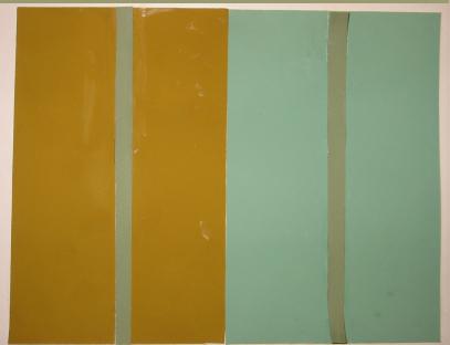

In this example the vertical patches in the two panels appear different
in respect of color, although they are intrinsically qualitatively identical
(you can verify this yourself -- the color picker tool in photoshop/gimp
will tell you that the two patches are identical).
The difference in appearance is due to the contrast of each with its
background.


Studies VI-3.1 and VI-3.2 show the same color contrast effect seen in
Study VI-2.1, but here the intrinsic qualitative identity of the test patches
(in these cases, the central Xs) can be verified by attending to the place
in the lower center of each study where the Xs join.

I find Study VI-4.2 a very strong example of simultaneous contrast --
the two central patches look extremely different in respect of color, despite
their intrinsic qualitative similarity.

This final example is a cleaned up digital version of an Albers-style exercise made by my friend William Duty. Once again, the simultaneous contrast makes the central stripes in the two panels look extremely different in respect of color, despite the intrinsic qualitative similarity of the two stripes. In the original, made with colored paper, scissors, and glue, the two central stripes were cut from (numerically) the same piece of colored paper.
